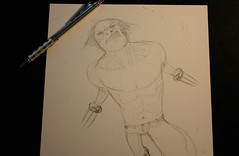
Finishing up the pencils. ( Oh, I should point out, if you missed my previous post with Wolvie, this isn't for a cover or anything official. This was/is just a random piece I got the urgings to do to stay sane while working on some other more constrained stuff )
Was having fun not dealing with line weights and a distorted look. Probably thanks to the good dose of Frank Quietly, Geoff Darrow & Nate Simpson lately. ( Yes I know they do actually use line weight, more referring to their insane detail levels, but I can't remember the artists that don't and let the colour guys do all the work...) for me I plan on doing lots of tones on this one to bring stuff out, instead of the lines themselves perhaps.
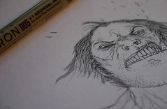
I think I'm getting addicted to these close up shots of the art as I work. I just dig them to bits.
Most people who don't really know my work, read my books etc but know my name still dismiss what I do as "on the computer" as if I press a few buttons and it all happens. Sadly for me ( I wish it was that easy! ) it's not the case. Never was.
Now, more than ever, I seem to actually put more into the real world drawings long before it reaches the computer stage. It's funny really. I probably do more real world work than a bunch of the "traditional" artists now, as the industry in general goes from straight pencils to computer colouring. Yet I'm one of the ones accused of relying on the digital too much!
I love art as artifact. It would drive me insane not to have a physical record of the work I did...don't think I'll ever be doing art completely by computer, I'll just use it to help and augment the process. The computer, or rather the art programs on them, are really just new tools most of us learn to use differently.
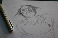
Another pic as I do down the body, inking. No rendering, no weight, just one line consistency. Seeing what I can do when I change it up a bit.
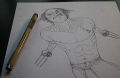
Nearly done, except for the damn chest hair. Not looking forward to that. Not at all. But it must be done. For the whole image I've just used a .005 Pigma Micron. Archival ink, waterproof, which is good for the watercolour/ink tones I plan on putting into it later.
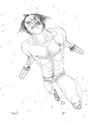
Here's the basic line work. Any budding colourists out there want to take a stab at it? Rather curious to see how others make it look. Hope this image is good quality enough for. Should be a bitmap .tiff file.
If you're reading this on the blog, get onto flickr and select "all sizes" then find "original" for the big arse version.
If you do colour it up, would love to see and indeed, post the results in later bloggins'. Then we can compare my final to the ones you guys do.
I should point out, the idea is to *not* try to emulate my own colour "look"...just to colour it the way you see fit.
Should be interesting!

8 comments:
Bah. I don't see why some people romanticize "the old school"/pre-computer ways of doing things so much. A lot of that old process and workflow was that way simply because it was cheap and fast and within the limits of the then-current technology.
Tools are just tools, and now we have some different and in some ways better ones.
I love this drawing. It makes me wish you'd draw a whole Wolverine book in this style. It would definitely give Moebius' Silver Surfer a run for its money.
As for your need to have a tangible drawing on paper -- I'm jealous that you can create such a beautiful piece without the benefit of ctrl-Z. Digital tools are great, but there's nothing quite like a real drawing, is there?
Hi there, great drawing. Here's my version. I tried to be simple but hopefully not TOO simple. Thanks for the opportunity to colour it!
http://www.jundooz.com/download/templesmith_wolverine.jpg
Great line. I want to play !
My work: [here]
Thanks !
Kapow!
http://retroaero.com/temp/Logan.jpg
Christ, mine is terrible, but here it is.
Mostly flats, but I'm bad at this whole "art" thing.
Sweet sketch Ben.
I took a few minutes too.
http://www.mbirkhofer.com/artwork/templesmith/wolviec.jpg
Gave this one a shot, decided to try a brighter, more 'conventional' look for the coloring for the contrast compared to your linework. And then my eyes got all fucked and I walked away.
http://i549.photobucket.com/albums/ii385/richardbazaar/templesmith.jpg
Post a Comment