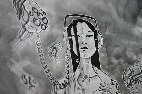
Well, the news went live yesterday, over at Bleeding Cool, so I can finally show the progressions of how I did the cover! Sorry if this is a larrrrrge, picture heavy post.
& yes, I'll be in the UK for about 2 weeks. ThoughtBubble festival, Traveling Man stores signings in Manchester & Newcastle, Comica stuff down London way and an Orbital Comics signing too. Will blog details later ( Or check the appearances section of my actual website, www.templesmith.com ) but YES, will be doing commissions if I can, and signing as many books as possible for sure.
So...
Was a complete honour to be asked to do the cover to the latest Popgun Anthology from Image Comics.
Why? Well, I wasn't able to contribute to the last one ( no time sadly ) and the previous cover guys have been Mike Allred, Paul Pope & Tara McPherson. That's pretty damn spiffy company that is.
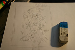
It all starts with a rough. A really rough, rough.
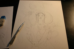
Early pencils, yes, I'm looking at a couple photos for this one, trying to go a bit more realist than cartoony.
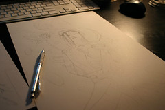
Ever wonder how I tweet and watch so much crap on Netflix while I draw? Well, the computer is right in front of me at all times.
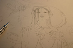
Tightening up the pencils a bit, have put the dragon in for placement, even though I actually draw that separately later.
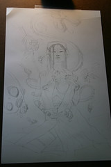
The final pencils before I go to ink. Yeah, this pic is slightly out of order, sue me!
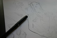
The inking begins. Using a great brushpen the uber talented Nikki Cook put me on to.
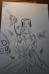
Main inks done. Just some bold lines really. I plan on the textures and paint to really be more about this picture than line work ultimately.
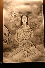
Err..no photos of the paint job til it's end! Lots of watercolour washes basically. Tried to get lots of stain type textures going on apart from anything else.
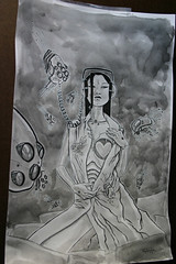
Paper gets a bit wrinkled with all the water I've put onto it. Before I scan, I add all the white lines with a white pen.
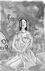
The final original real world art, as it looks after I've scanned it in, ready to do all the extra bits on the computer. Wish people would realize I actually draw...often times way more than the typical comic book artists!
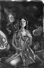
I start darkening that stuff up. Also drop in bits of the photos I've been using for ref. A definite hint at a nose, cheek/mouth and bits of hand. Followed by lots of airbrush to merge it all and stuff and generally smooth it over a bit.
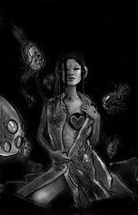
Really darken that sucker up. Lots of the burn tool, followed by some dodge as well.
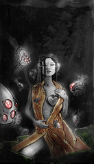
Altering the colours, adding more. Always start with what I want most prominent first...but before the end of this image I change my mind and make the whole thing overall warm colours. ( Instead of my original plan of maybe blues with red bits to pop it out. )
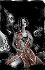
Some colour! Also, add a pattern to her dress. More of the dodge tool as well it seems.
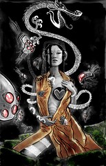
Add the Dragon, which I drew separately on another sheet. With it layered this way, I can do fancy things with it instead of having to pick it out of the background.
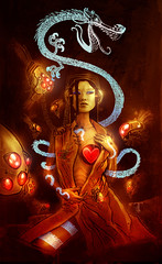
Add some overall tones. Not to mention some tricks with the dragon line work, courtesy of some textures I copy/paste into it from earlier things I've done.
I'll actually have a couple artist proofs of this image on me while I'm doing my UK appearances, so if anyone wants one, they are signed, numbered and for sale!
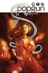
The final as the Popgun guys now have it after I worked out how the dragon should mostly work with their logo/cover style.

9 comments:
...WOW !!
Ah, I love this cover so much! It's great seeing the process here.
You're selling prints of this? Sign me up! I'd love to have this hanging on my wall.
Thanks again, Ben. Amazing work!
-- D.J.
That can be arranged sir! I'll print another proof up when I'm next in country.
RIGHT ON! I love this image with all my cold, dead heart. You outdid yourself, sir!
fantastic! thanks for this!
thank you for showing us this.
Beautiful!! & enjoyed seeing the process thanks
Cool. Good to see the white space being utilized for the illustration, as was always intended. I was a bit disappointed that the previous two cover artists didn't make more use of it.
GREATTTTTTTTTTTTTT
Post a Comment